How to Use Color Theory in Roblox Fashion
Creating standout Roblox clothing isn’t just about design - it’s about understanding how colors work together. By using color theory, you can create outfits that grab attention, feel balanced, and appeal to players.
Here’s what you need to know:
- Color Wheel Basics: Use the color wheel to find complementary (opposite), analogous (neighboring), or triadic (evenly spaced) color combinations for balanced designs.
- Warm vs. Cool Colors: Warm colors (reds, yellows) are bold and energetic, while cool colors (blues, greens) are calming and refined.
- 60/30/10 Rule: Allocate 60% to a base color, 30% to a secondary color, and 10% to an accent color for a clean and polished look.
- Contrast and Depth: Use light and dark shades for contrast and layer colors for depth to make designs pop.
- Test in Roblox Lighting: Always check how your designs appear in various in-game lighting conditions.
Tools like Roblox templates, Alive Studio, and graphic design software (like GIMP or Photoshop) can help refine your creations. Stick to 2–4 colors in your palette, avoid oversaturation, and follow Roblox’s content guidelines to ensure your outfits resonate with players and comply with rules.
Basic Color Theory Principles for Roblox Fashion
Now that you know why color theory is important, let’s dive into the key principles that can elevate your Roblox fashion designs. These fundamentals are the backbone of crafting eye-catching and cohesive outfits.
How to Use the Color Wheel
In Roblox fashion, your choice of colors plays a huge role in how your designs are perceived. The color wheel is a handy tool that helps you select colors that naturally work well together. It’s a circular chart featuring primary colors (red, blue, yellow), secondary colors (green, orange, purple), and tertiary colors, which bridge the gaps between them.
Colors that sit side by side on the wheel create smooth, subtle combinations, while those directly across from each other make for bold, high-contrast pairings. Start with a color you love, then use the wheel to find complementary or harmonious matches to create intentional, balanced designs.
Color Combinations That Work
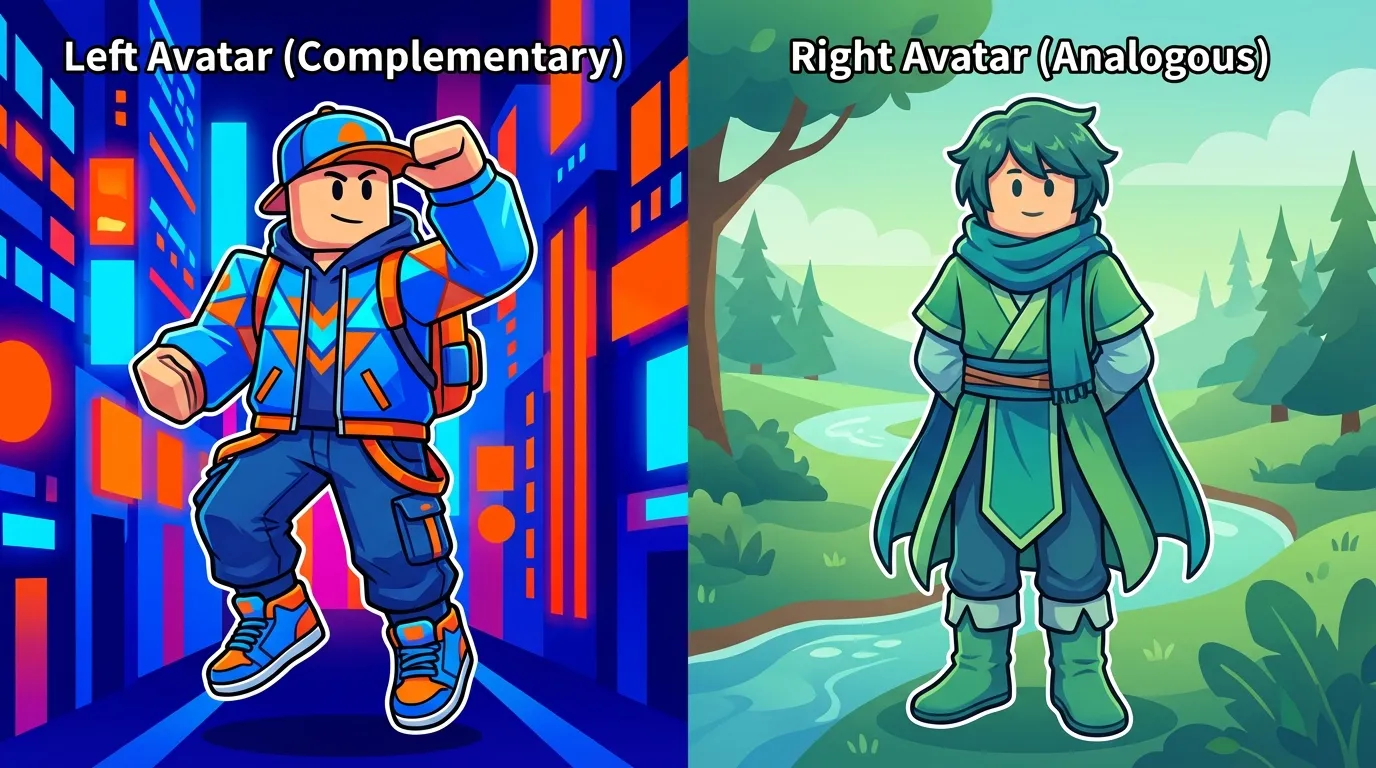
Some color schemes are tried and true when it comes to creating polished Roblox outfits. The three most effective ones are complementary, analogous, and triadic combinations. Each offers a unique style and visual effect for your clothing designs.
| Color Scheme | Description | Visual Effect | Example |
|---|---|---|---|
| Complementary | Opposite colors on the wheel | Bold, vibrant, attention-grabbing | Purple top with yellow accessories |
| Analogous | Neighboring colors on the wheel | Subtle, harmonious, cohesive | Blue shirt, teal pants, green shoes |
| Triadic | Three evenly spaced colors | Balanced, playful, dynamic | Red jacket, yellow pants, blue shoes |
- Complementary schemes are perfect for making bold statements with high contrast.
- Analogous combinations shine when you want a sophisticated, coordinated look.
- Triadic palettes strike a balance between vibrancy and cohesion, giving your designs energy without overwhelming them.
Stick to 2–3 colors in your palette to keep your designs clean and visually appealing. Too many colors can make your outfit feel chaotic.
Warm vs. Cool Colors
Colors can evoke strong emotions, so understanding the difference between warm and cool tones is crucial. Warm colors - reds, oranges, and yellows - are bold and energetic, perfect for outfits meant to stand out. On the other hand, cool colors - blues, greens, and purples - are calming and sophisticated, making them ideal for formal wear or understated designs.
To create a balanced look, follow the 60/30/10 rule:
- 60% for your base color
- 30% for a secondary color
- 10% for an accent color
This proportion ensures one color doesn’t overpower the rest, giving your design a sense of hierarchy and balance.
Lastly, always test your color choices in various Roblox lighting settings. Colors that look great in your design software might appear different in-game due to lighting effects. Make adjustments as needed to ensure your outfits look amazing across all environments.
Step-by-Step Guide to Applying Color Theory in Roblox Clothing
Follow these steps to design eye-catching Roblox clothing that feels polished and professional. Each step builds on the principles of color relationships and visual harmony.
How to Pick Your Color Palette
Start by selecting your color palette - it’s the backbone of any standout Roblox outfit. Begin with one main color that sets the tone for your design. Once you’ve chosen your main color, use the color wheel to find 1–3 supporting colors. You can go for complementary colors for bold contrast or analogous colors for a more unified and smooth appearance.
For example, if blue is your main color, pairing it with orange creates striking contrast, while combining blue with blue-green and green gives a more cohesive vibe.
Here’s a practical tip: if you’re designing streetwear, black can serve as your main color. Add gray and white for balance, then include a pop of red to make the outfit stand out. Keep your palette limited to 2–4 colors to maintain a clean, professional look.
Adding Contrast and Balance
Contrast is key to making your Roblox clothing visually appealing and easy to distinguish in-game. Without it, your design might look flat and lose its impact.
Use light and dark shades thoughtfully to highlight key elements. For instance, pairing a dark jacket with a light shirt and finishing with bright red shoes creates clear separation and draws attention to important details.
Think about where to place contrasting elements. For a summer-themed outfit, you could choose a light blue dress as the main piece, pair it with white sandals for subtle contrast, and add a yellow sunhat as an accent. This approach ensures visual balance while maintaining a strong hierarchy in your design. Once you’ve nailed the contrast, you can start adding depth using color layers.
Using Color Layers for Depth
Flat designs can feel lifeless, but layering shades and tints of your chosen colors can add depth and make your clothing look more dynamic and realistic.
Start with a base color for the main part of the clothing. Then, use a darker shade to create shadows in areas like under collars or fabric folds. Add lighter tints to highlight raised areas or spots that would naturally catch light.
For example, if you’re designing a brown sweater, use brown as the base, a darker brown for shadows, and a lighter brown for highlights. This technique creates a three-dimensional effect without relying on harsh shadows. Avoid pure black for shading, as it can look unnatural, and skip pure white for highlights; instead, use softer tints of your base colors to keep the design natural and polished.
To take it further, experiment with overlay blending modes at reduced opacity for subtle effects. Adding a slight texture or noise can also make your clothing look more realistic. These small details can elevate your design, helping your Roblox clothing stand out in a crowded marketplace.
Tools and Resources for Roblox Fashion Creation
Having the right tools can make all the difference when it comes to creating standout Roblox clothing. From official templates to advanced design software, these resources help you craft professional-looking outfits that fit perfectly on avatars.
Roblox Templates and Design Tools
Start with official Roblox templates to ensure your designs align with avatar dimensions. These .png templates are available on the Roblox Developer Hub and are tailored for shirts, pants, and accessories. Each template provides a clear layout, showing where your design will appear on the avatar.
The templates include transparent sections for design placement and gray areas that represent the avatar body. This guide helps you position patterns and colors accurately. For instance, when designing a t-shirt, the template clearly marks the front, back, and sleeve areas.
Using these templates minimizes common issues like stretching or misalignment on different avatar bodies. They also feature guidelines to help you avoid placing key design elements too close to the edges, reducing the risk of them being cut off during upload. These templates are a must-have foundation before diving into advanced design tools like Alive Games for Skins.
Alive Games for Skins: A Web-Based Design Editor
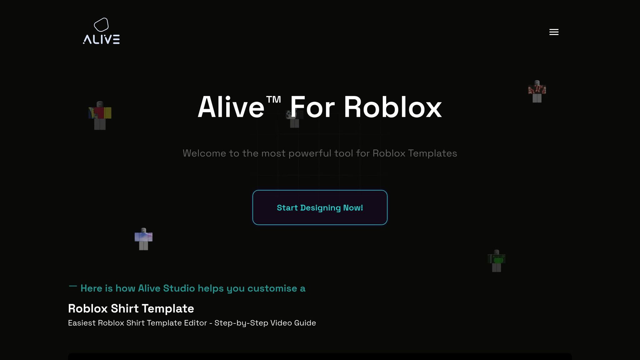
Alive Studio simplifies the creation of Roblox clothing with its user-friendly, web-based interface and built-in color tools.
"Alive Studio is our free online tool that allows you to create and customize your own Roblox shirt templates without the need to download any software." - Alive™ For Roblox
This tool allows you to experiment with color palettes - like complementary and analogous combinations - directly in your browser. No need to download templates or switch between multiple programs. Everything is streamlined for ease of use, making it ideal for creators of all skill levels.
Alive Studio focuses on the essentials, like color selection and placement, so you can spend less time navigating complicated software and more time designing. If you're interested, you can join the waitlist for early access.
For those looking to expand beyond Roblox-specific tools, there are plenty of graphic design programs that offer more advanced features.
Other Graphic Design Programs
If you're ready to take your designs to the next level, these programs provide powerful tools for color manipulation and design refinement:
- Paint.NET: A free Windows program with features like color pickers, layer support, and blending modes for adding depth to your designs.
- GIMP: This free, open-source tool includes a color wheel picker, HSV sliders, and custom palette saving, making it easy to maintain consistency across multiple clothing items. GIMP also supports layer blend modes for more intricate designs.
- ibis Paint X: Perfect for mobile users, this app offers color harmony guides that suggest complementary and analogous color combinations based on your base color, making it a great choice for beginners learning color theory.
- Adobe Photoshop: A favorite among professional designers, Photoshop provides advanced tools like LAB color space support, precise color matching, and detailed color correction. While it offers unmatched features, its $20.99 monthly subscription is best suited for those committed to regular Roblox clothing design.
When selecting a design program, think about your operating system, budget, and the specific features you need. Many free options are excellent for mastering the basics, while paid programs unlock more advanced capabilities for detailed and complex designs.
Tips for Better Color Use in Roblox Outfits
Designing eye-catching Roblox clothing involves more than just picking colors that look nice. To make your designs stand out and work well in any game environment, here are some practical tips to keep in mind.
Test Your Designs in Different Game Lighting
Roblox games feature a variety of lighting conditions, and these can significantly change how colors appear. Make sure to test your designs in multiple settings, from bright outdoor scenes to dimly lit interiors. Also, examine your clothing both up close and from a distance to ensure it maintains its impact no matter the perspective.
Common Color Mistakes to Avoid
After testing your designs in various lighting setups, watch out for these common mistakes:
- Using pure black for shading: Instead of pure black, use a slightly darker version of your base color to create smoother, more natural shadows that blend well.
- Poor contrast: Low contrast can make details disappear, while oversaturated colors can overwhelm the eye. Try dialing back saturation by 10–20% for a polished look.
- Ignoring the 60/30/10 rule: This guideline suggests using 60% of a base color, 30% of a secondary color, and 10% of an accent color for balanced compositions. Skipping this rule can lead to unbalanced designs.
For shading, experiment with slightly darker, hue-shifted colors, and always check how your design looks at different zoom levels to ensure clarity and detail.
Following Roblox Content Rules
Before uploading your clothing, take a moment to review Roblox's official content guidelines. These are available on their developer forum and help center. Be careful not to use color combinations that could unintentionally create symbols or patterns considered inappropriate, and avoid infringing on intellectual property by sticking to original designs. Additionally, think about how your color choices might be interpreted in different regions to avoid unintended meanings. Balancing creativity with compliance ensures your designs are both appealing and rule-abiding.
Conclusion: Improve Your Roblox Fashion with Color Theory
Using color theory can transform your Roblox designs from basic to standout creations. The key ideas covered here - grasping the color wheel, understanding warm and cool color dynamics, and crafting harmonious combinations - are the building blocks for designing eye-catching outfits that stand out in the Roblox marketplace.
Start by choosing a dominant color, then complement it with secondary and accent shades based on the color wheel. Whether you opt for complementary, analogous, or triadic schemes, each approach offers a unique visual flair. Stick to the 60/30/10 rule to maintain balance and ensure your designs feel cohesive and pleasing to the eye.
For a polished, professional touch, experiment with color layering techniques. Instead of relying on stark black for shadows, use slightly darker tones of your base colors to create depth and a more natural look. Pair this with warm hues to bring certain elements forward and cool tones to push others back. These techniques give flat textures a three-dimensional feel, making your designs visually engaging.
Color choices also play a huge role in how players perceive your designs. For example, red communicates energy and confidence, blue conveys calmness and trust, and purple suggests creativity and luxury. By aligning your palette with the mood or message you want to convey - whether bold and vibrant or refined and mysterious - you can create clothing that resonates with players and performs well in the marketplace.
Tools like Alive Games for Skins make applying color theory even easier. Features like customizable templates, built-in color pickers, and real-time previews simplify the creative process. Plus, exportable formats ensure your designs translate seamlessly into Roblox, freeing you to focus on creativity without technical hurdles.
As you work on your next project, put these principles into action. Select a thoughtful color palette, test it under different lighting conditions, and aim for 2–3 carefully chosen colors to make a strong impact. With each design, your grasp of color theory will grow, helping you create clothing that not only looks polished but also connects emotionally with players.
FAQs
How can I make sure my Roblox clothing designs look great in different in-game lighting?
When creating Roblox clothing, it's important to make sure your designs look great in all kinds of lighting. To do this, stick to balanced color contrasts and steer clear of colors that are too dark or overly bright, as they can appear distorted in certain lighting. Test your outfits in various in-game settings - daytime, nighttime, and interiors - to check how the colors and details hold up.
For added precision, try tools like Alive Games. This platform offers a simple editor that lets you design and customize high-quality skins and clothing. You can experiment with colors and textures, ensuring your creations stay vibrant and visually appealing no matter the lighting conditions in Roblox.
What mistakes should I avoid when using color theory in Roblox fashion design?
When working with color theory in Roblox fashion design, there are a few missteps you'll want to steer clear of:
- Overloading your design with colors: Using too many colors can make your design feel messy and overwhelming. Stick with a simple palette of 2-4 colors that work well together.
- Missing the mark on contrast: If your colors lack contrast, details can blur together, but too much contrast can feel jarring. Strive for a balance that makes key elements stand out without overpowering the overall look.
- Combining clashing hues: Some colors just don’t play nicely together. For example, certain shades of red and green can create a jarring effect. A color wheel can help you find pleasing combinations, like complementary or analogous colors, that bring harmony to your designs.
By keeping these tips in mind, you can craft Roblox outfits that are both eye-catching and balanced.
What is the 60/30/10 rule, and how can I use it to design stylish Roblox outfits?
The 60/30/10 rule is a straightforward guideline from color theory that helps create designs that are visually balanced and pleasing. It breaks down like this: 60% of your look should feature a dominant color, 30% a secondary color, and 10% an accent color. This method keeps everything cohesive while adding just the right amount of contrast or flair.
When applying this to Roblox fashion, start by selecting a dominant color for the main pieces of your outfit, such as shirts or pants. Then, choose a secondary color that either complements or contrasts with the dominant color for smaller elements like accessories or patterns. Finally, use your accent color sparingly - think trims, logos, or small highlights - to give your outfit that extra touch of personality. Play around with different color combinations until you find one that matches your style perfectly!