How to Use Color Theory for Game Skins
Color theory is a powerful tool for designing game skins that look great and function well in gameplay. By understanding how colors interact, you can create designs that evoke emotions, enhance visibility, and reinforce a character's identity. Here’s a quick breakdown:
- Start with the Color Wheel: Use primary, secondary, and tertiary colors to build your palette. Focus on hue (color), saturation (intensity), and value (lightness/darkness) for precise adjustments.
- Set a Purpose and Mood: Define the skin's role (e.g., stealthy, bold, or futuristic) and pick colors that align with its emotion and function.
- Build a Palette: Choose a dominant base color and expand with complementary, analogous, or triadic schemes. Balance bold colors with neutrals for clarity.
- Use Contrast and Saturation: Ensure key details stand out with value contrast (light vs. dark) and sparing use of high-saturation accents.
- Test in Game Conditions: Check the skin's performance under different lighting and distances to ensure visibility and balance.
Tools like Alive Games’ skin editor make it easy to apply these principles, offering features like color pickers, palette presets, and real-time 3D previews. By practicing these techniques, you can create game skins that are both visually appealing and functional.
Setting the Purpose and Mood of Your Skin
Connecting Emotions to Color Choices
Start by defining your skin's purpose. Is it designed to blend into shadowy urban rooftops for a stealthy sniper? Or maybe it’s meant to radiate a cyberpunk vibe with glowing neon accents? Perhaps it needs to feel approachable and warm for a healer role. The purpose of the skin dictates every color decision you make. For example, stealth-focused skins often rely on darker, low-contrast tones to blend into common environments, while skins meant to feel premium might use brighter hues, metallic finishes like gold, or iridescent details to convey exclusivity and high value.
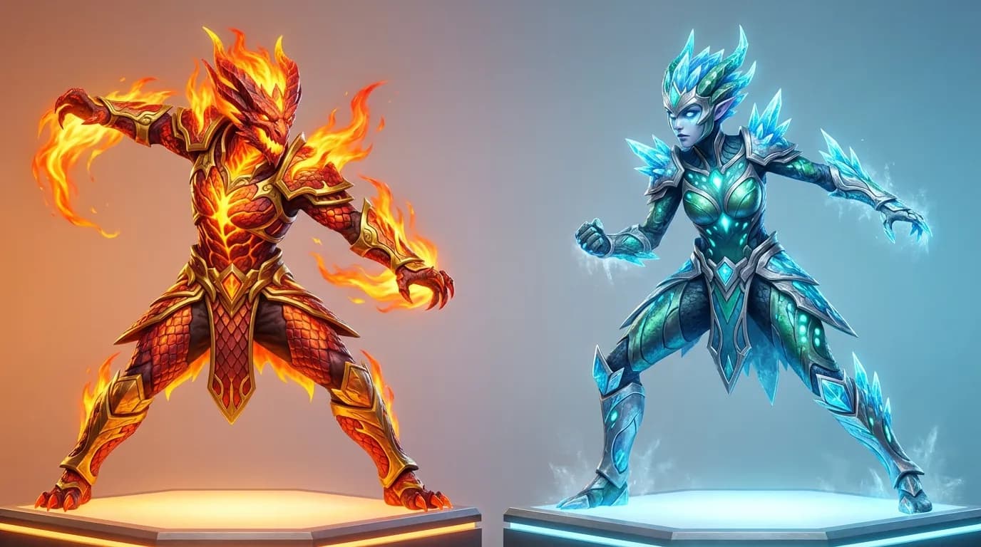
Next, think about the emotions you want the skin to evoke and link those to specific color families. Aggressive or high-energy combat skins thrive on warm, saturated colors like reds, oranges, and intense yellows, which deliver a bold, striking appearance. On the other hand, calm or tactical skins lean on blues and greens with medium-to-low saturation, offering a sense of control and professionalism. For futuristic or sci-fi designs, neon cyans, magentas, and lime greens paired with dark neutrals like black or charcoal create a sharp, cyberpunk aesthetic. Playful or casual skins feel best with softer shades - think pinks, baby blues, or mint greens - and gentle contrasts that feel inviting rather than intense.
Refining the mood comes down to adjusting value and saturation. A deep, muted red feels serious and grounded, while a bright, saturated red suggests urgency or danger. Light blues feel calm and approachable, whereas deeper blues can evoke a tactical or high-tech tone. Olive greens suggest a military style when muted, but when brightened to emerald or neon, they feel energetic or futuristic. Similarly, dark purples paired with gold accents suggest luxury or royalty, while bright magentas lean playful or cyberpunk. These subtle tweaks allow you to fine-tune the skin’s emotional impact while keeping it functional and visually appealing.
Making Skins Readable and Functional
A skin that compromises gameplay clarity misses the mark. Silhouettes and key shapes must remain easy to read at typical in-game camera distances. To achieve this, focus on value contrast between major forms and details, but steer clear of overly busy patterns near critical edges. Skins with too little contrast may render enemies hard to track, while excessive contrast everywhere can cause eye strain or distract players from key areas.
Stick to a limited palette. Choose one primary hue family, one or two accent colors, and a few neutrals - like black, gray, white, or muted browns - to avoid overwhelming the design with visual clutter. Balance your tones carefully, reserving extreme contrasts for focal points. Use broad, simple shapes for major armor or weapon sections, and save intricate patterns or textures for less critical areas so they don’t interfere with readability. Always test your skin at small sizes and against both bright and dark backgrounds to ensure the core silhouette and key details remain clear, even when finer elements blur. Also, avoid high-contrast patterns near the central aiming zone to maintain focus during gameplay.
Explaining Color Theory With Only Video Game Character Designs
Building Color Palettes That Work Together
Selecting a Base Color and Expanding From It
Start by choosing a primary color that sets the tone for your design - whether it’s a weapon, character, or avatar. This main color should dominate the look, covering about 60–70% of the visible area, giving the design its core identity. For instance, a fiery red or orange base works well for a high-energy Counter-Strike 2 weapon skin, while a soothing blue might suit a calm Roblox avatar. Want to suggest luxury? Gold tones can do the trick.
Once your base color is set, expand your palette by picking 4–6 neighboring hues from the color wheel. Analogous colors create smooth, harmonious transitions, while complementary colors offer a striking contrast. Adjust lightness and saturation to add depth - use softer tones for larger areas like backgrounds or armor plates, and save brighter, more saturated tones for the details. For example, in Naraka: Bladepoint, a white and reddish-brown base can be enriched with deeper reds and golds to create an elegant, tiered look that signals quality.
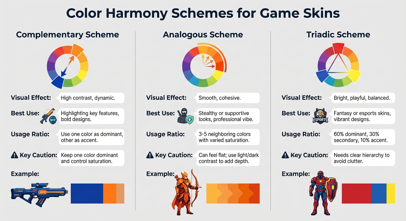
Types of Color Harmony
After defining your base and supporting colors, use color harmony rules to tie everything together.
Complementary schemes pair colors opposite each other on the wheel - like blue and orange or yellow and purple. These combinations are great for creating high contrast and energy. For example, blue and orange accents can make certain features pop without overwhelming the overall design. Use complementary colors sparingly for details like armor trim or weapon highlights, especially in fast-paced games like Fortnite, where too much contrast can affect visibility.
Analogous schemes stick to 3–5 neighboring colors, such as yellow-orange, orange, and red-orange. This approach creates a smooth, unified look. A warm, fiery palette for a Minecraft skin, for instance, feels cohesive and immersive. Analogous schemes are ideal for stealthy or supportive skins, where a calm and professional vibe is needed. However, because the hues are similar, you’ll need to rely on light and dark contrasts to keep the design clear and visually interesting.
Triadic schemes use three evenly spaced colors on the wheel - like red, blue, and yellow - for a bold and balanced look. Assign one color as the dominant (around 60%), another as secondary (about 30%), and the last as an accent (10%). Adjust saturation levels carefully to keep the design visually balanced. For Roblox skins, this approach can create vibrant, playful designs. Just be cautious with your ratios - too much of any one color can make the design feel chaotic.
| Scheme Type | Visual Effect | Best Use in Skins | Key Caution |
|---|---|---|---|
| Complementary | High contrast, dynamic | Highlighting key features, bold designs | Keep one color dominant and control saturation |
| Analogous | Smooth, cohesive | Stealthy or supportive looks | Can feel flat; use light/dark contrast |
| Triadic | Bright, playful | Fantasy or esports skins | Needs clear hierarchy to avoid clutter |
Mixing Bold Colors with Neutral Tones
Once you’ve built a harmonious palette, balance it out by pairing bold colors with neutral tones.
Neutrals like black, white, gray, or desaturated browns act as grounding elements, making vibrant colors stand out. Use neutrals for 70–80% of the design and save bold colors for 20–30% accents. For example, in a fast-paced shooter, a mix of white and reddish-brown neutrals paired with red and gold accents can create a polished, high-quality look while maintaining clarity.
To maximize contrast, place bright accents on muted neutral backgrounds. Avoid over-saturating neutral tones, as this can muddy the overall palette, and be mindful of how colors appear under different in-game lighting. What looks great in a neutral editor might blend into the environment during gameplay. Experts often recommend pairing soft, low-saturation backgrounds with pure, vibrant highlights - like blue and orange accents against a neutral base - for designs that stand out in any setting.
Using Contrast and Saturation in Your Designs
Value Contrast for Better Visibility
Value contrast - the difference between light and dark - plays a big role in making designs more visible and drawing attention to key details like weapon edges or character features. A good rule of thumb is to keep backgrounds darker and focal points brighter. For example, in Counter-Strike 2, a weapon skin that uses dark gray shadows paired with bright white highlights remains easy to spot, whether you're in a dim corridor or a sunlit outdoor area. Similarly, in Naraka: Bladepoint, basic skins tend to use softer transitions, like light brown paired with muted red. On the other hand, premium skins crank up the contrast with bold combinations, such as bright red details against white backgrounds, making decorative elements like ribbons stand out even in fast-paced action sequences. After setting up value contrast, fine-tuning color saturation ensures that focal elements grab attention without overwhelming the overall design.
Controlling Saturation for Balance
Saturation - the intensity of a color - helps guide the viewer’s eye, but too much can overpower a design. The trick is to use high saturation sparingly, focusing it on key areas, while keeping surrounding elements more muted. For instance, a Fortnite skin might feature a low-saturation gray base with vibrant blue accents, ensuring the design remains visually clear. In Naraka: Bladepoint, Matari costumes illustrate this balance well: lower-tier skins use subtle, desaturated reds for a toned-down look, while premium versions showcase bright, high-saturation reds, giving them a more eye-catching and valuable appearance. Using bold, pure colors in small doses against neutral backgrounds - like black, white, or gray - makes these accents pop even more, creating a balanced and visually appealing design.
Warm and Cool Colors for Depth
Warm colors (reds, oranges, yellows) tend to jump forward and feel energetic, while cool colors (blues, greens, purples) recede, evoking calm and stability. This interplay between warm and cool tones adds depth and realism to designs. For example, metal skins in Minecraft often use warm highlights along edges to mimic a natural shine, contrasted with cool blue shadows for a realistic effect. Fabric textures can benefit from this approach too - cool tones in folds and warm tones on creases create a three-dimensional look. A great example is the Naraka: Bladepoint Kurumi skin, which pairs blue fabrics with orange accents to inject energy and life into the design. Similarly, applying warm tones to raised areas and cool tones to recessed sections enhances spatial depth, ensuring the skin remains engaging across different gaming environments.
| Contrast Type | Impact | Example in Games |
|---|---|---|
| Value (Light/Dark) | Improves visibility and highlights details | Naraka: Bladepoint premium skins with bold contrasts versus softer basic designs |
| Saturation (High/Low) | Keeps focal points clear and balanced | Fortnite skins with vivid accents on muted gray bases |
| Warm/Cool | Adds depth and realism | Blue-orange combinations in Naraka: Bladepoint for dynamic, layered designs |
Step-by-Step Color Theory Workflow
The Skin Creation Process
To craft effective game skins, start by defining the purpose and mood of your design. Identify the essential elements that need to stand out - like team colors or weapon barrels. Begin by sketching your design in grayscale. This helps establish clear value contrasts for the most important elements, ensuring they remain distinguishable at typical in-game distances before adding any color.
Once the grayscale foundation is ready, choose a dominant base hue with low to medium saturation for larger areas. Then, incorporate one to three accent colors. Stick to harmony rules when selecting these accents - use complementary pairs (like blue and orange) or analogous schemes (such as blue and blue-green). Apply these accent colors sparingly to details like logos, trims, or other focal points.
Check that the key shapes stay distinct across different backgrounds. Adjust saturation levels next: tone down busy, large areas to avoid overwhelming the design, but keep smaller regions bright and saturated to naturally draw the player's eye. For added depth, shift between warm and cool tones - use warm highlights for lit areas and cooler tones for shadows.
Testing Skins in Different Game Conditions
Once your design is complete, test it in the game engine under various lighting scenarios. Preview how your skin appears under dynamic shadows, spotlights, ambient light, and at different times of day. Adjust colors and brightness as needed to ensure the design remains clear in low-light settings, like caves or night maps, and in brighter environments with high glare. Test it against diverse backgrounds to confirm that your value contrast prevents the skin from blending in. If the design competes with the background, tweak saturation or increase the contrast between foreground and background.
Examine the skin at typical in-game distances to make sure key details and accent colors remain visible, even when the character is moving or viewed from afar. If important elements become hard to see, adjust their contrast or reposition accents to improve visibility. Finally, gather feedback from players or teammates. Pay attention to comments like "the skin blends into the background" or "team colors aren't clear enough." Use this input to refine your design - whether that means tweaking contrast, resizing accents, or revisiting your color choices.
Using Alive Games for Skins to Apply Color Theory
Color Theory Tools and Features
Alive Games makes it simple to bring color theory into your game skins through its intuitive browser-based skin editor. Designed for games like Counter-Strike 2, Roblox, Fortnite, and Minecraft, the editor includes color pickers with HSB/HSV sliders (hue, saturation, brightness/value), giving users the same level of control professional game artists use. You can tweak each property individually - whether it’s adjusting the hue to set the base color, dialing down saturation for neutral areas, or brightening accents to make them pop.
The editor also offers palette presets based on classic color theory approaches - complementary, analogous, triadic, and monochromatic. These presets automatically generate harmonious accent and neutral tones from your chosen base hue, saving you the trouble of mastering complex color principles. Templates for various game assets, like rifles, knives, character outfits, vehicles, and blocks, come with predefined material zones (e.g., metal, fabric, decals, and UI markers). This setup helps you assign colors consistently across different layers, ensuring your designs feel polished and intentional.
For real-time feedback, the editor features 3D previews with rotatable cameras and adjustable lighting. This allows you to see how your design holds up under different lighting conditions. For instance, you can check if a vibrant red accent becomes overpowering in warm lighting or if subtle blue details fade into shadows. You can then make any necessary adjustments before exporting your finished design.
Export and Game Integration Options
Once your skin is ready, Alive Games supports exporting to standard texture formats like PNG and JPG, with game-specific presets tailored to each platform's resolution, aspect ratio, and UV layout. You can download layered files or flat textures and easily import them into tools like Steam Workshop, Roblox Studio, Unreal/UEFN, or Minecraft resource packs, following the standard processes for each game.
Another handy feature is the ability to save and reuse custom palettes. This is especially useful for creating cohesive collections or sets. For example, you can apply the same base palette to multiple weapons or characters, then tweak contrast, saturation, or accent colors to create "rare", "epic", and "legendary" variants. This mirrors how commercial games use subtle color shifts to signal rarity tiers.
Tools for Beginners and Studios
Alive Games caters to both beginners and professionals. For newcomers, the platform offers guided templates, palette presets, and easy-to-use sliders, making it accessible for anyone to experiment with color harmony, mood, and contrast - no need for external software. As the platform puts it:
even a player with no skills can create 3D assets just from a prompt and a simple editor.
For studios and advanced users, Alive Games provides powerful features like batch processing, shared palettes, project libraries, and standardized export presets. These tools help maintain consistency across an entire skin line, making it an efficient pre-production step for larger teams. Whether you’re experimenting as a hobbyist or fine-tuning designs for a professional project, Alive Games offers a streamlined way to bring your creative vision to life.
Conclusion
Color theory takes skin design from random choices to purposeful, functional creations. Start by defining the mood you want - whether it’s stealthy, aggressive, playful, or elite - and pick one or two main colors that reflect that vibe. From there, build a balanced palette using complementary, analogous, or triadic color schemes, and pair them with neutral tones. Use high-saturation accents sparingly - think logos or weapon edges - to grab attention without overwhelming the overall design.
Once your mood and base colors are locked in, shift your focus to contrast and clarity. Value contrast is the most critical factor for gameplay. Make sure your design performs well under all lighting conditions. Avoid color combinations that blend into common backgrounds or clash with team identifiers and UI elements.
The best way to refine your craft is through practice and observation. Study popular skins in the games you love. Pay attention to how they use limited palettes, warm and cool contrasts, and carefully placed accents. Then, try recreating those techniques with your own spin. Experiment with different harmonies on the same design to see how small tweaks in hue, value, or saturation can completely change the final look.
When you're ready to put theory into action, tools like Alive Games for Skins can help you create polished, game-ready designs for titles like Counter-Strike 2, Roblox, Fortnite, or Minecraft. Use the platform's color pickers to fine-tune hue, saturation, and value in real time. Export your skin and test it in-game to see how it performs.
Think of each skin as an experiment in color. Save multiple palette variations, analyze how each affects mood and readability, and refine your designs based on gameplay feedback. By applying color theory from the initial concept to in-game testing, you’ll ensure your skins are not just visually appealing but also enhance gameplay. With a clear vision, a cohesive palette, strong contrast, and consistent practice, you’ll develop the skills to create skins that stand out and function seamlessly in any game environment.
FAQs
How can color theory make game skins more effective?
Color theory plays a crucial role in making game skins stand out by improving their visual clarity and ensuring essential details catch the eye. By leveraging contrast, designers can emphasize key features, making skins more distinguishable during gameplay.
On top of that, using complementary color schemes creates designs that are both engaging and cohesive. A thoughtfully designed skin doesn’t just look good - it also adds to the gaming experience by being easy to recognize and interact with.
What tools can you use to apply color theory when designing game skins?
Alive Studio is a versatile tool crafted to make applying color theory to game skin design straightforward and fun. Its user-friendly editor and customizable templates let you play around with color harmony and contrast to create skins that stand out. The best part? You can handle everything online - no need to download or use extra software.
How can I make sure my game skin designs are clear and easy to see?
When creating game skin designs, it's important to test how they look in various settings to ensure they’re clear and visually appealing. Check how the skins appear against different backgrounds, under a range of lighting conditions, and from various distances to ensure they remain sharp and noticeable. Pay close attention to contrast, brightness, and color balance to highlight the most important details. Using tools like online editors can be a great way to simulate in-game environments and fine-tune your designs for the best possible outcome.